The Danforth
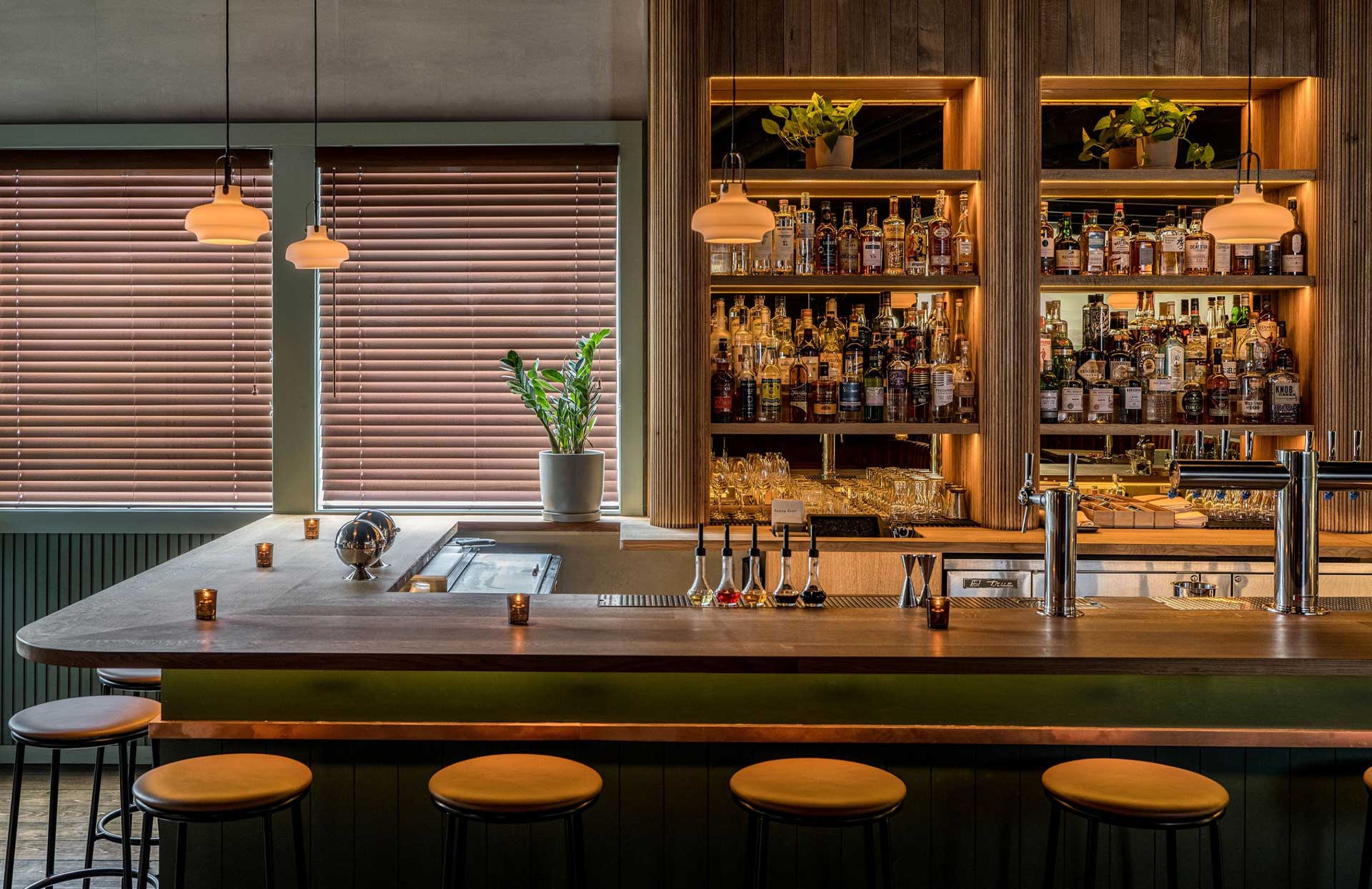
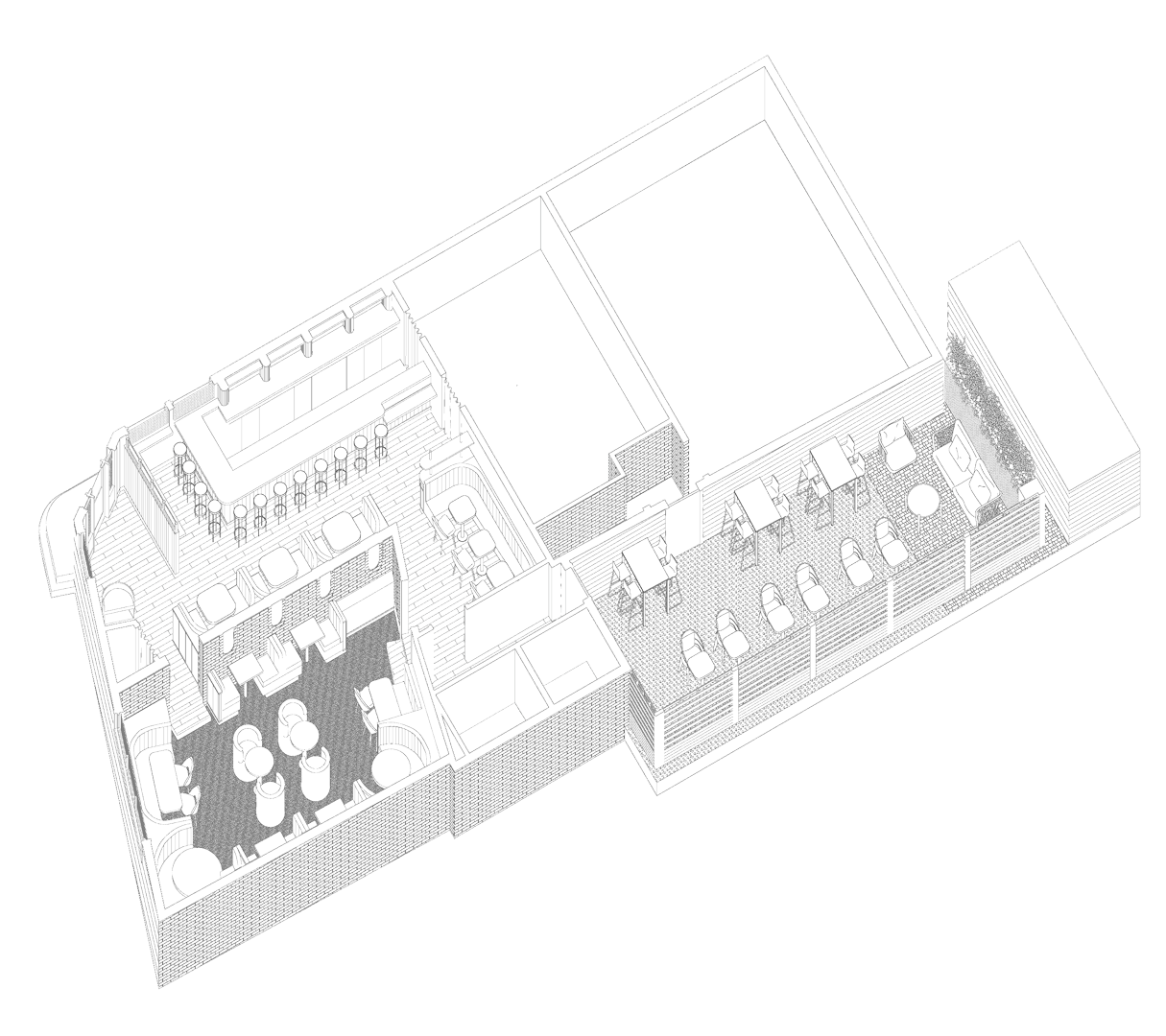
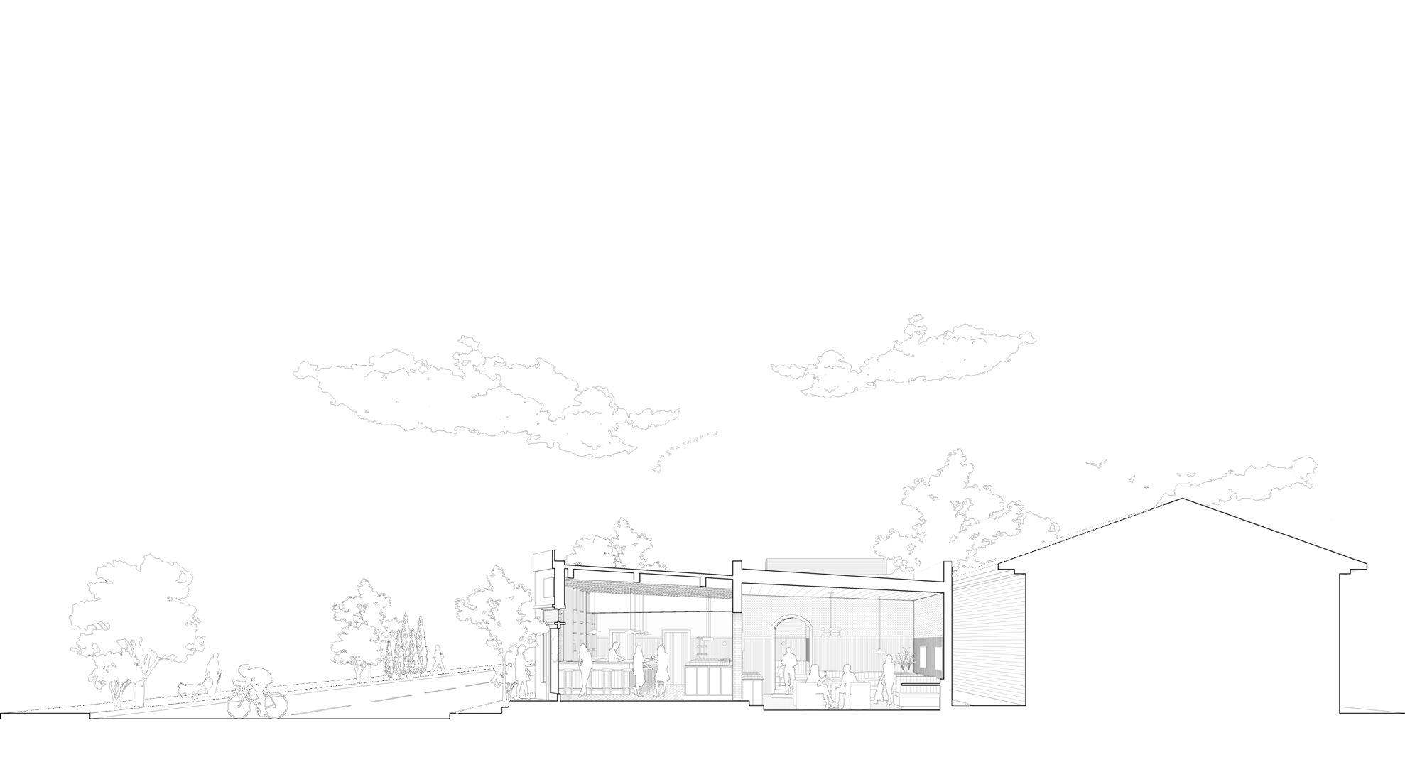
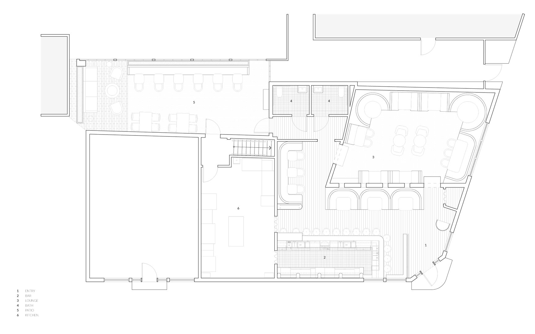
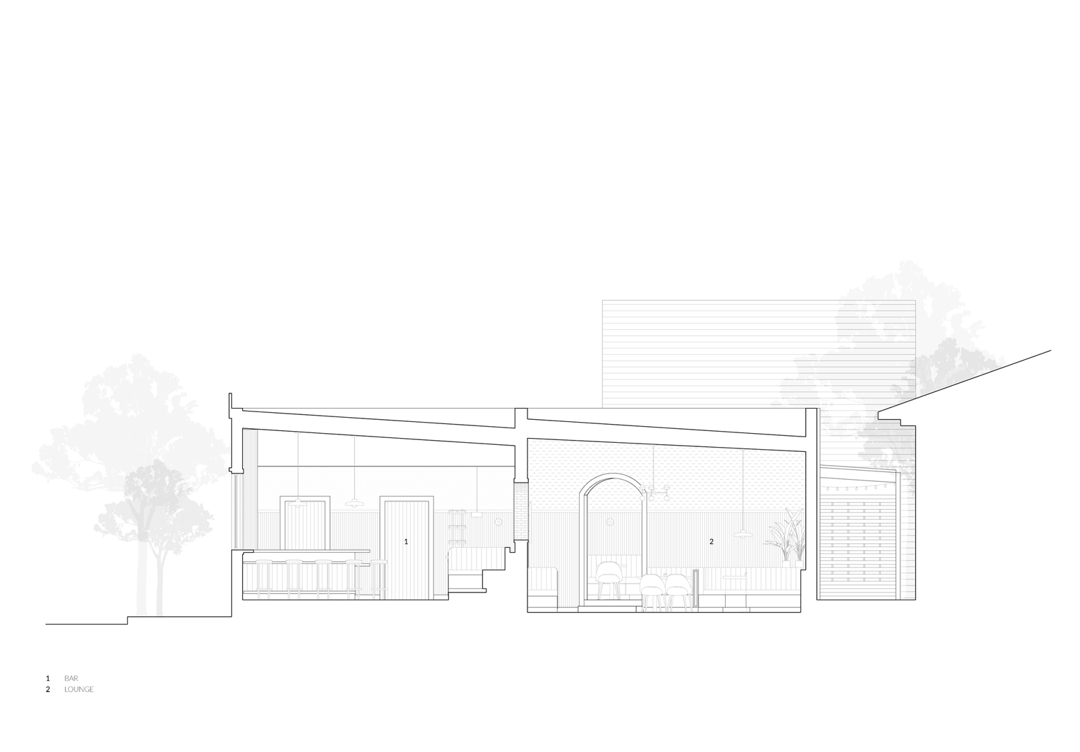
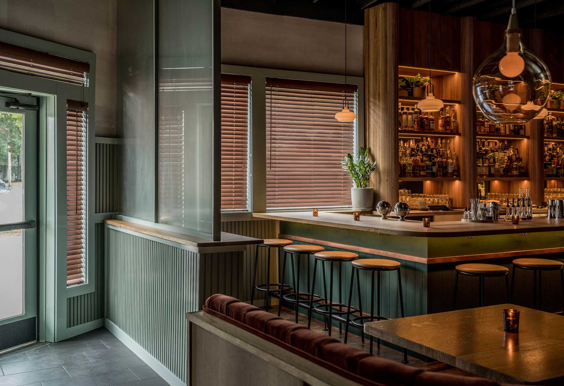
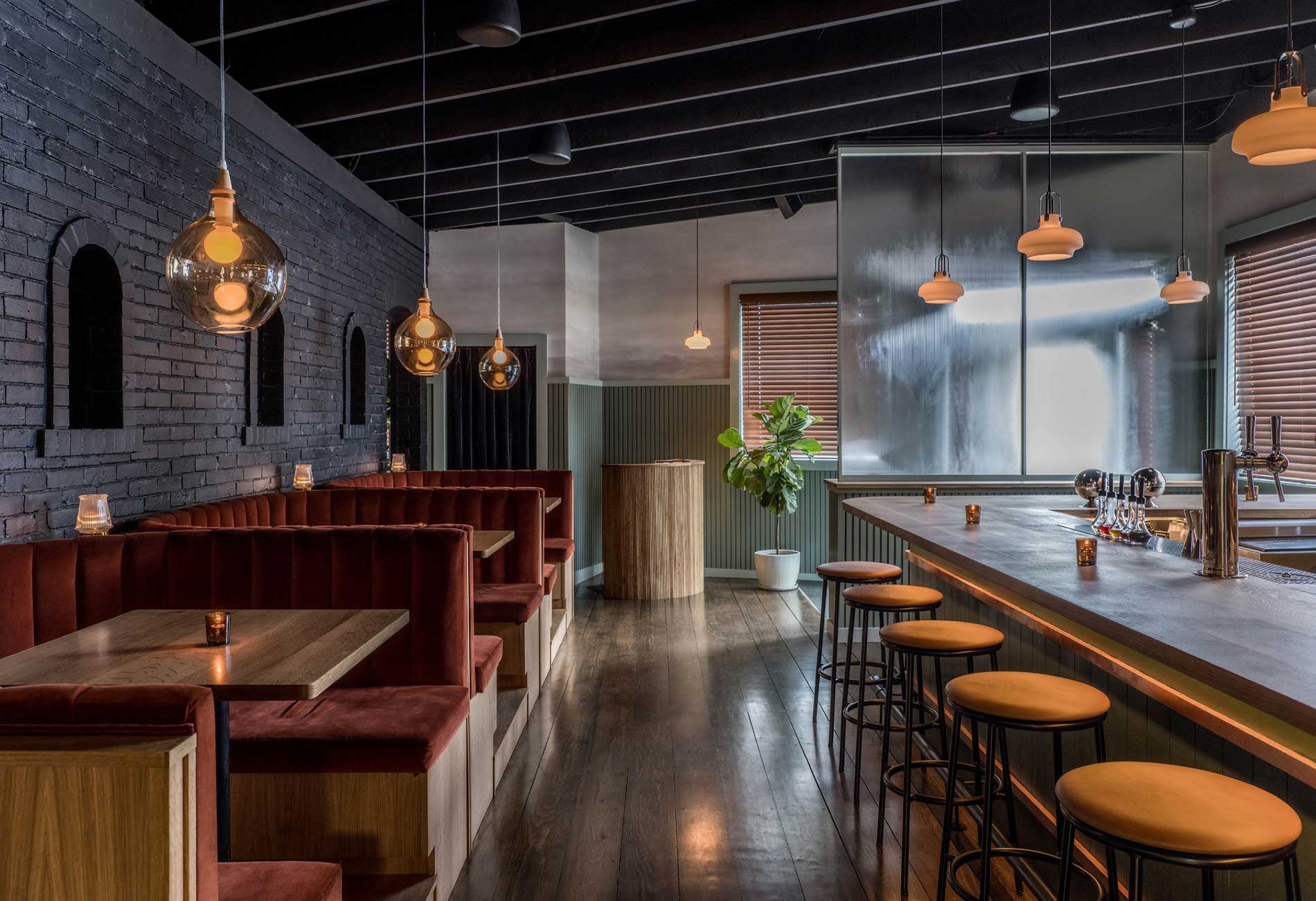
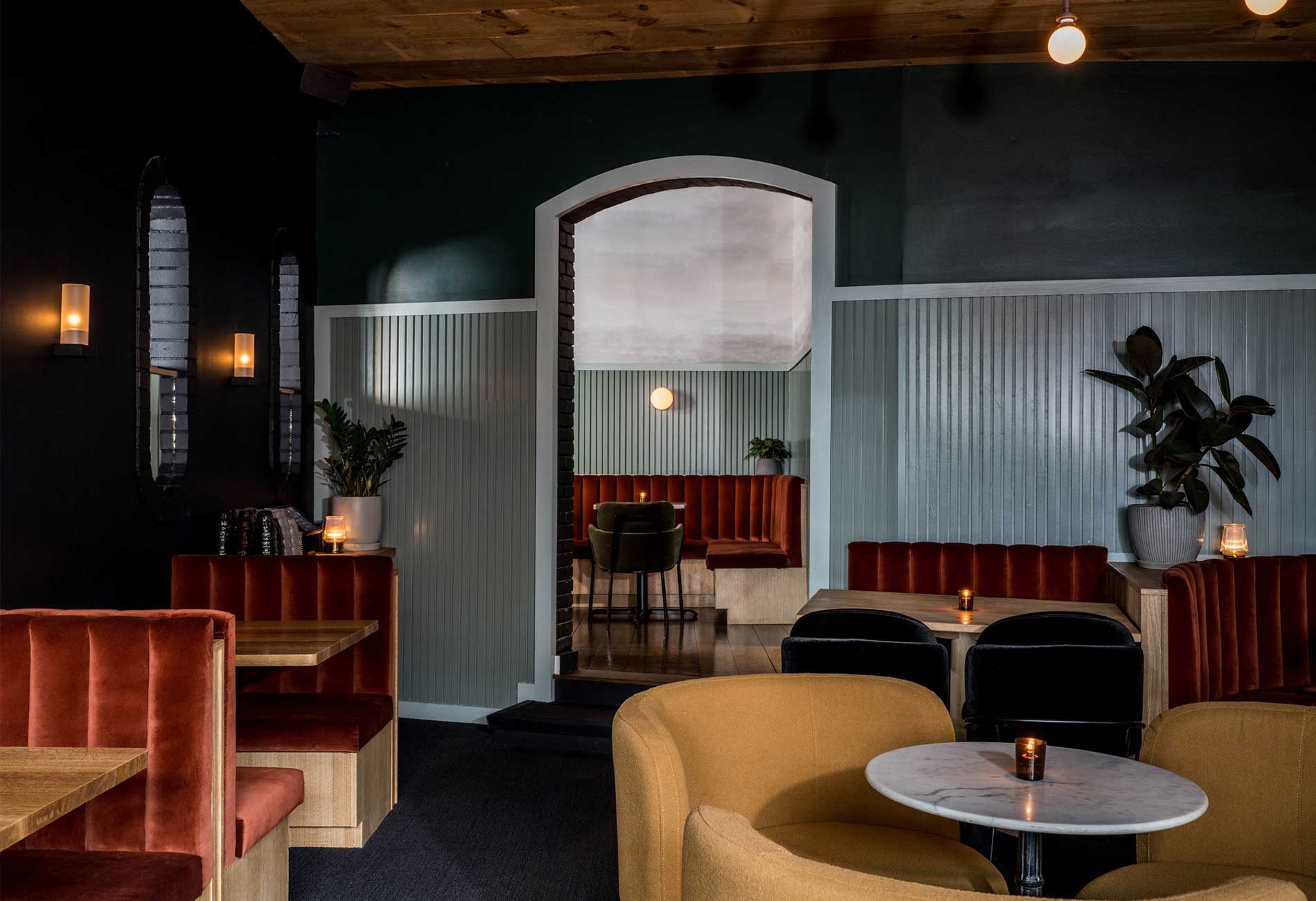
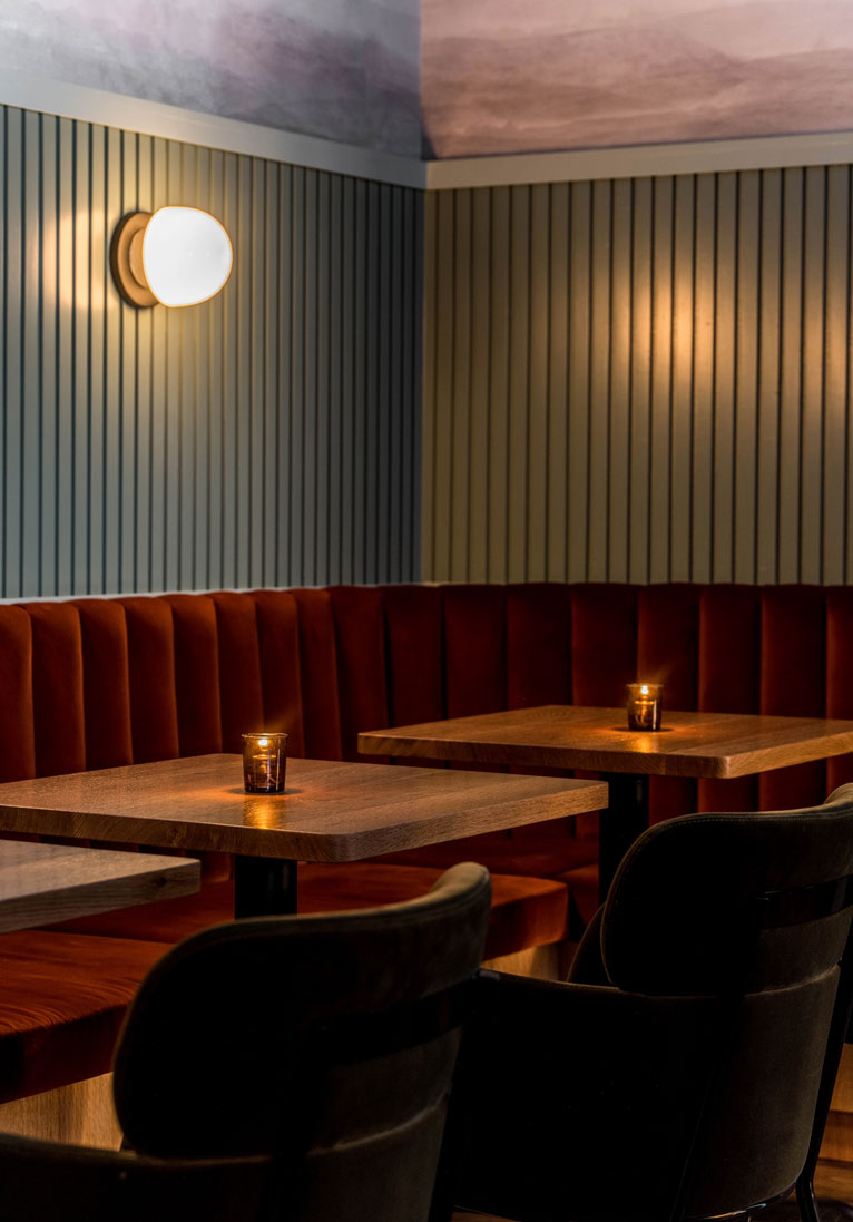
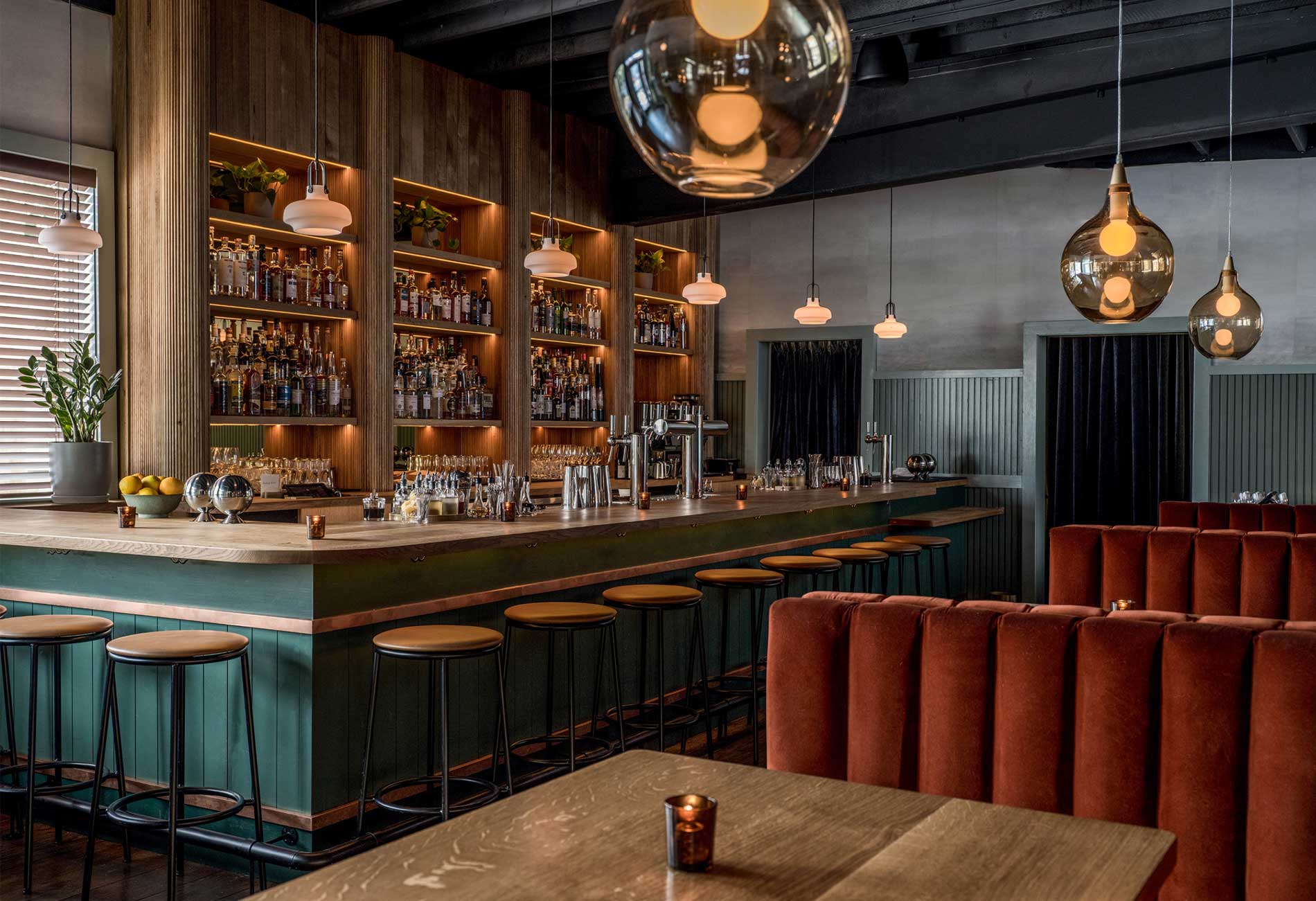
Located in the West End neighborhood of Portland, Maine, The Danforth is composed of three spaces: the bar, the lounge, and the three-season patio. Each space has subtly different treatments: the bar area has a lighter, textured wallpaper above a wainscot line, while the lounge — which is a couple steps down from the bar — has a darker paint finish above to introduce a moodier and softer energy at night. Similarly, the floor in the lounge is treated with a carpet, whereas the bar has wood floors.
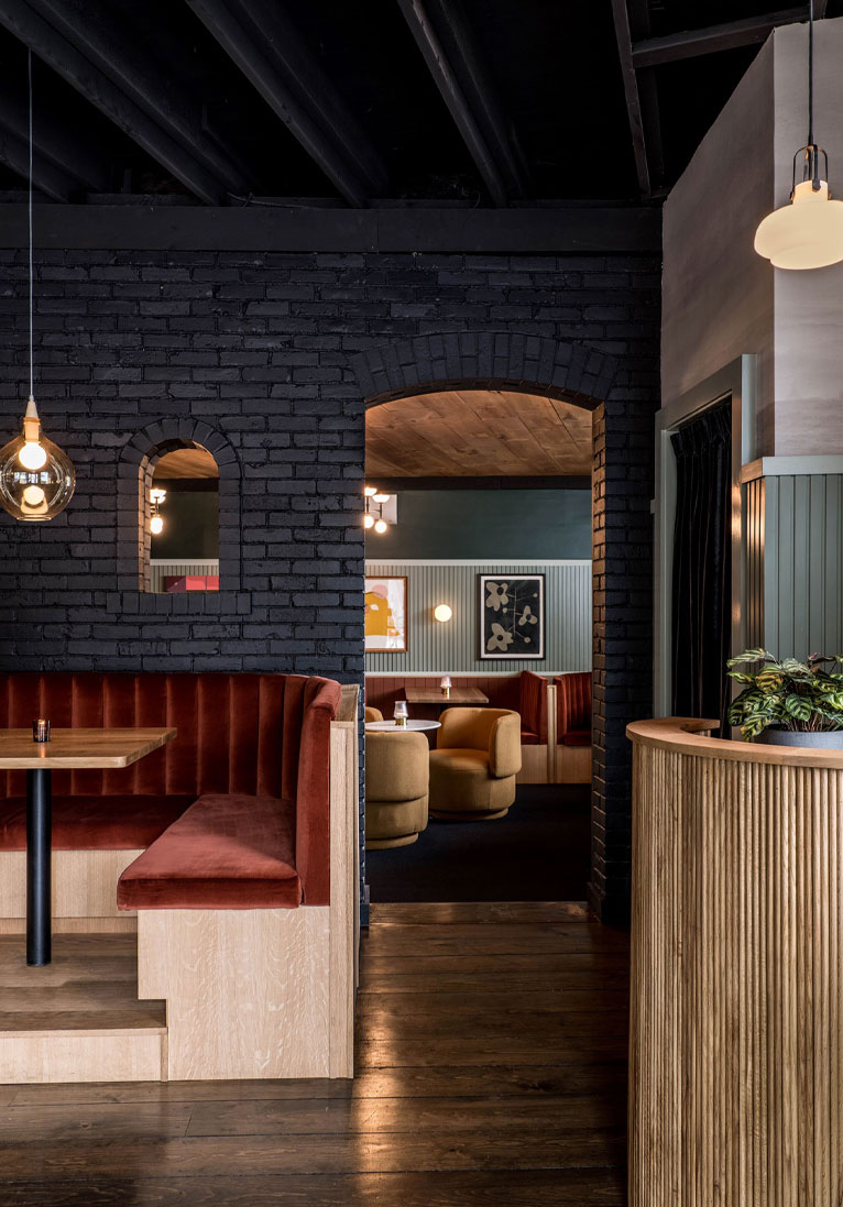
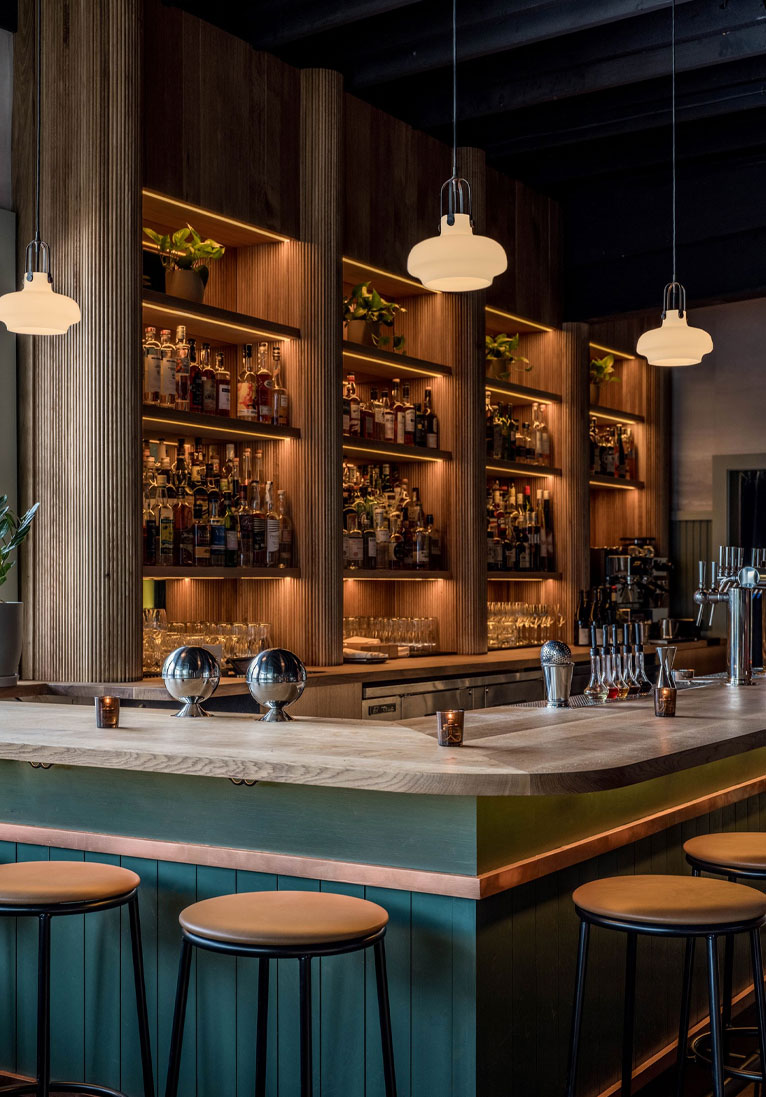
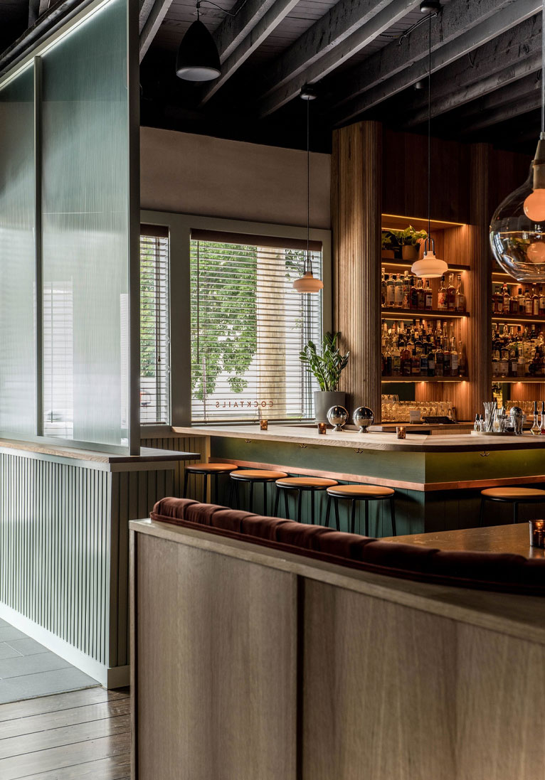
The Danforth is a flexible space, with a communal energy, that also provides opportunities for its patrons to tuck away into a corner for more intimacy if desired. The existing building is angular due to its trapezoidal site, so curvature was introduced into the design to help ease edges. As a result, the booths are rounded, soft and enveloping. This is also reflected in other millwork, such as the subtle curves and slatting on the bar, host stand and shelving which introduce an added layer of texture and depth.
The restaurant is composed of two spaces – the bar area and the lounge – each with subtly different aesthetic and atmospheric approaches, while keeping cohesion in mind. The bar area has a light textured wallpaper above a wainscot datum line, black exposed ceilings and wood floors, while the lounge — which is a couple of steps down from the bar — has a darker paint finish above to introduce a moodier and softer energy at night, wood ceilings for a warm glow and is carpeted to help soften the space further.
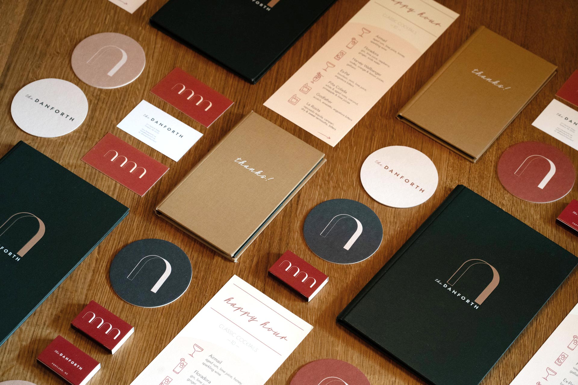
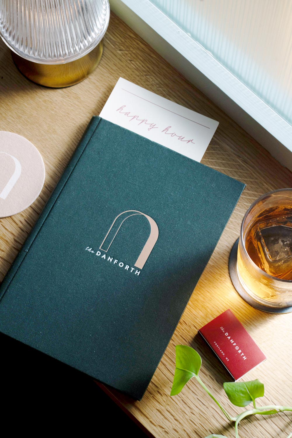
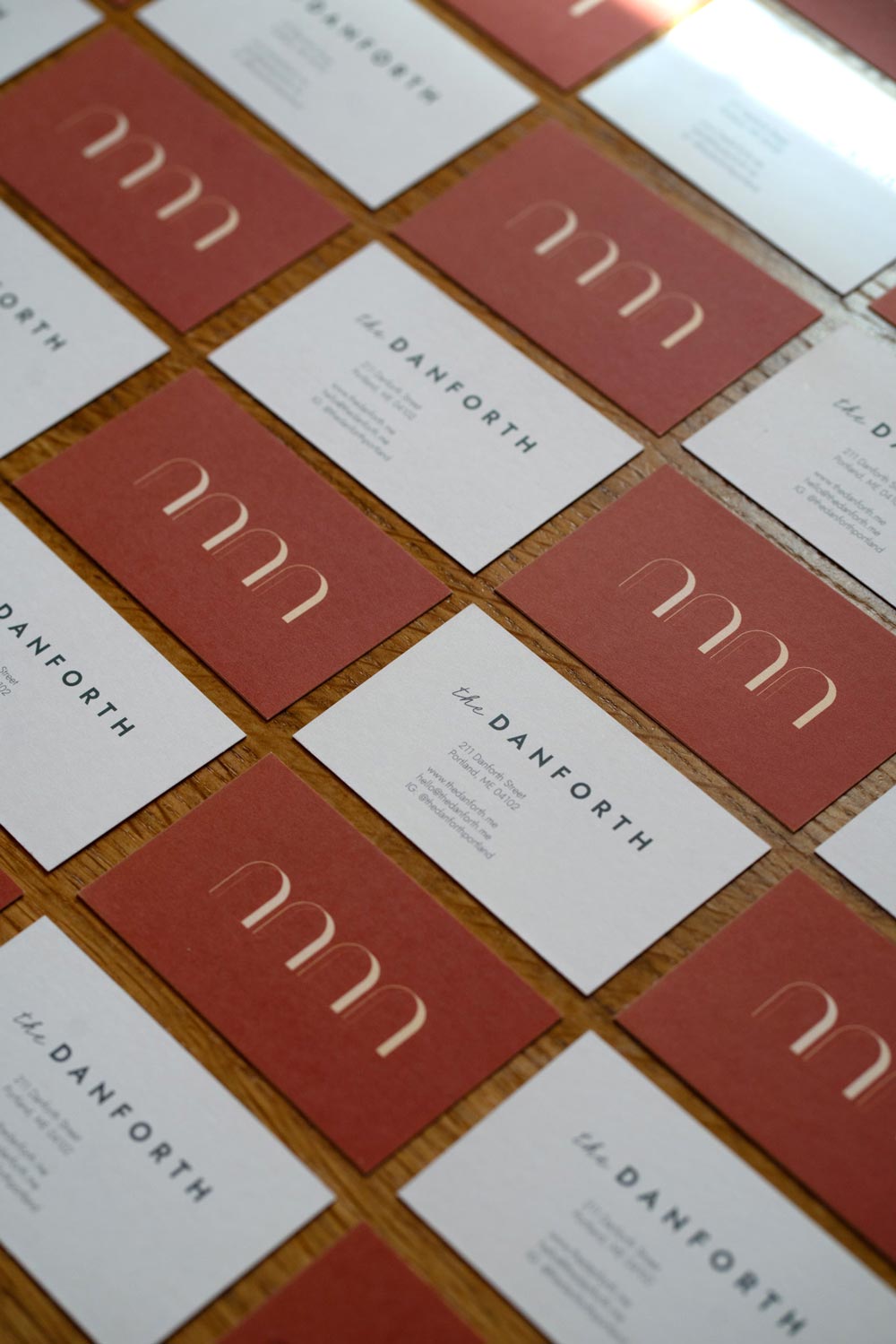
Between the two spaces sits an existing brick wall that, upon demolition, revealed four small archways that had been covered by the previous tenant. While the initial intent was to make larger openings between the two spaces, we decided to celebrate the existing arches not only in the spatial design, but also in the branding and collateral designed by AAmp for this project.
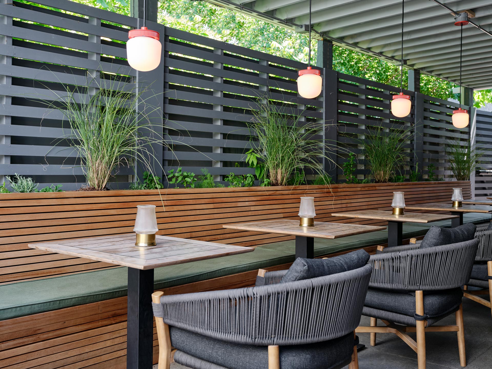
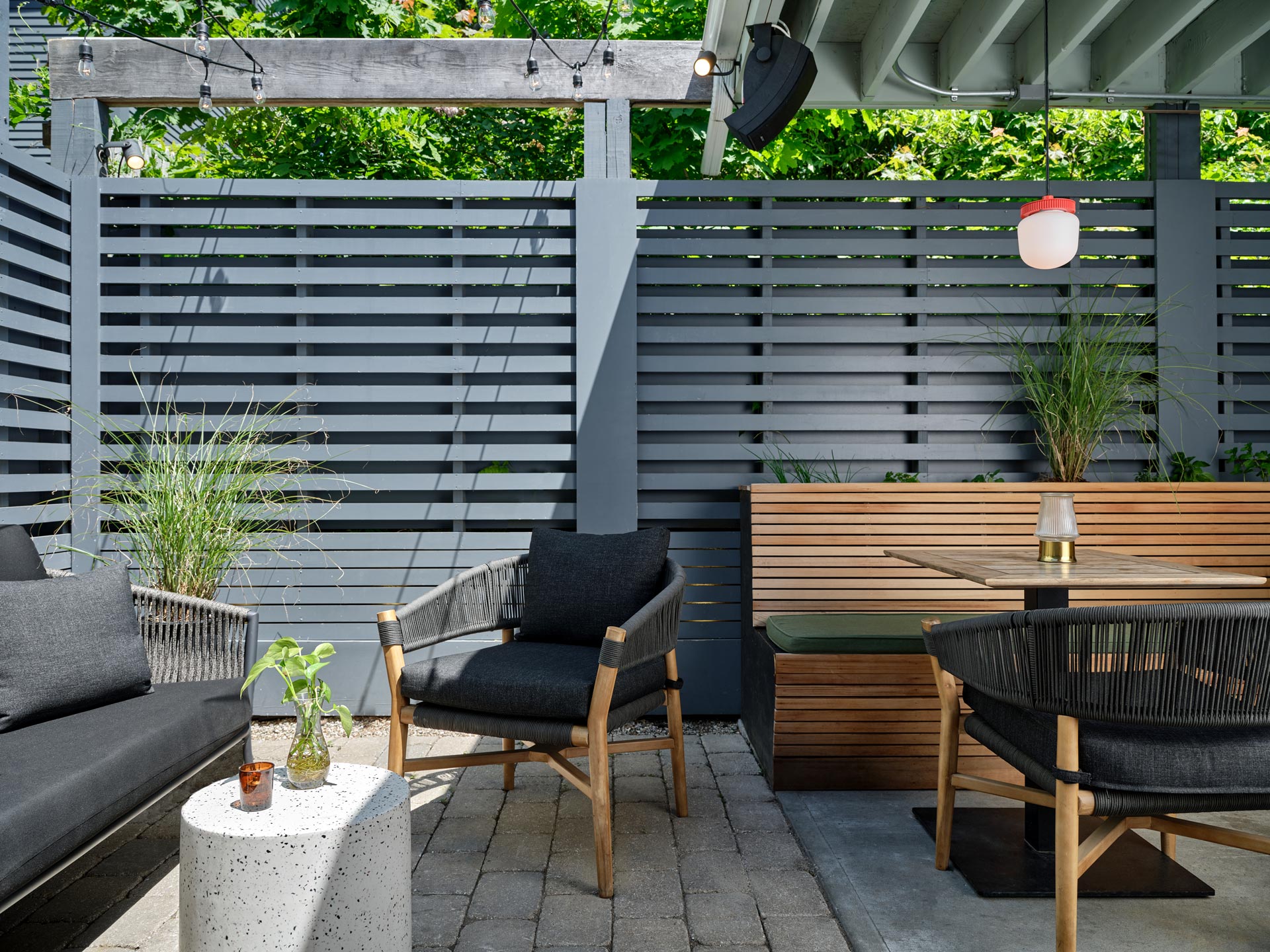
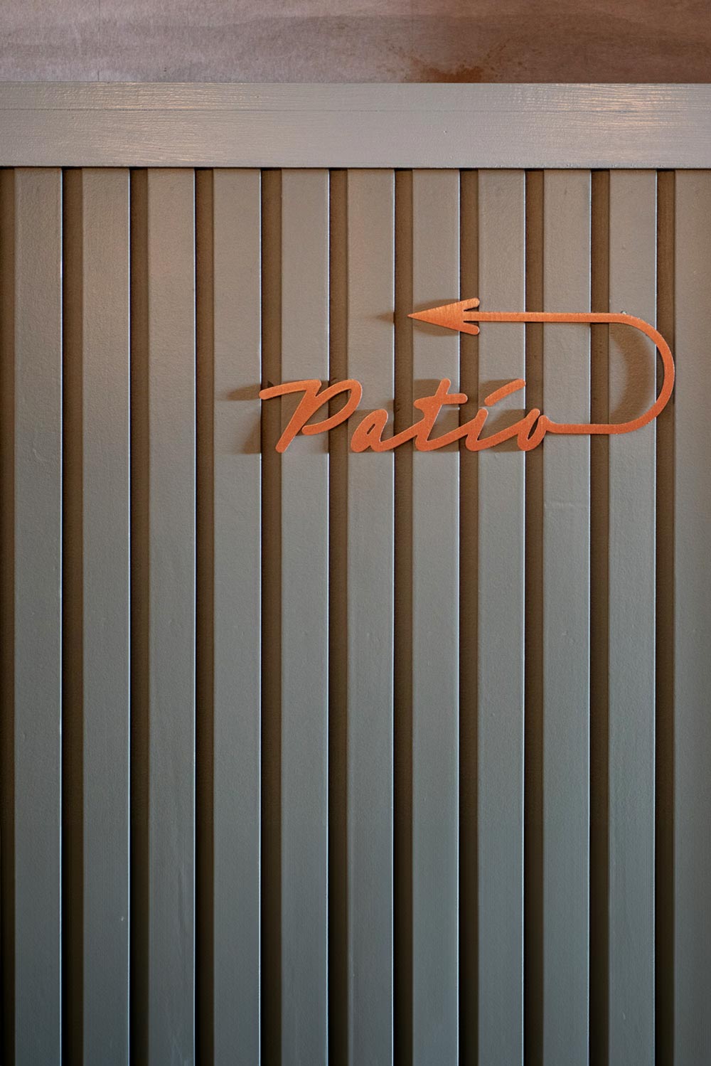
In the rear of the restaurant sits a three-season patio with heated floors and fixed awning to help protect from the elements. The patio has a mix of seating – a long banquette, a sofa seating group and high-tops – to provide further flexibility to the restaurant’s patrons. This space helps facilitate pop-ups and private events.
Prior to design, the existing space was disjointed in many ways by a series of underutilized and disconnected rooms separated not only by walls, but also by level changes. To bring cohesion and integration to the project we established a single wainscot datum line that runs throughout the entire project. At the bar area it appears lower, while at the lounge – a few steps down – it is higher and feels more enveloping. With that unifying element in place, we allowed everything above and below it to be somewhat different in each space, allowing each room to feel a bit unique and to serve different purposes.
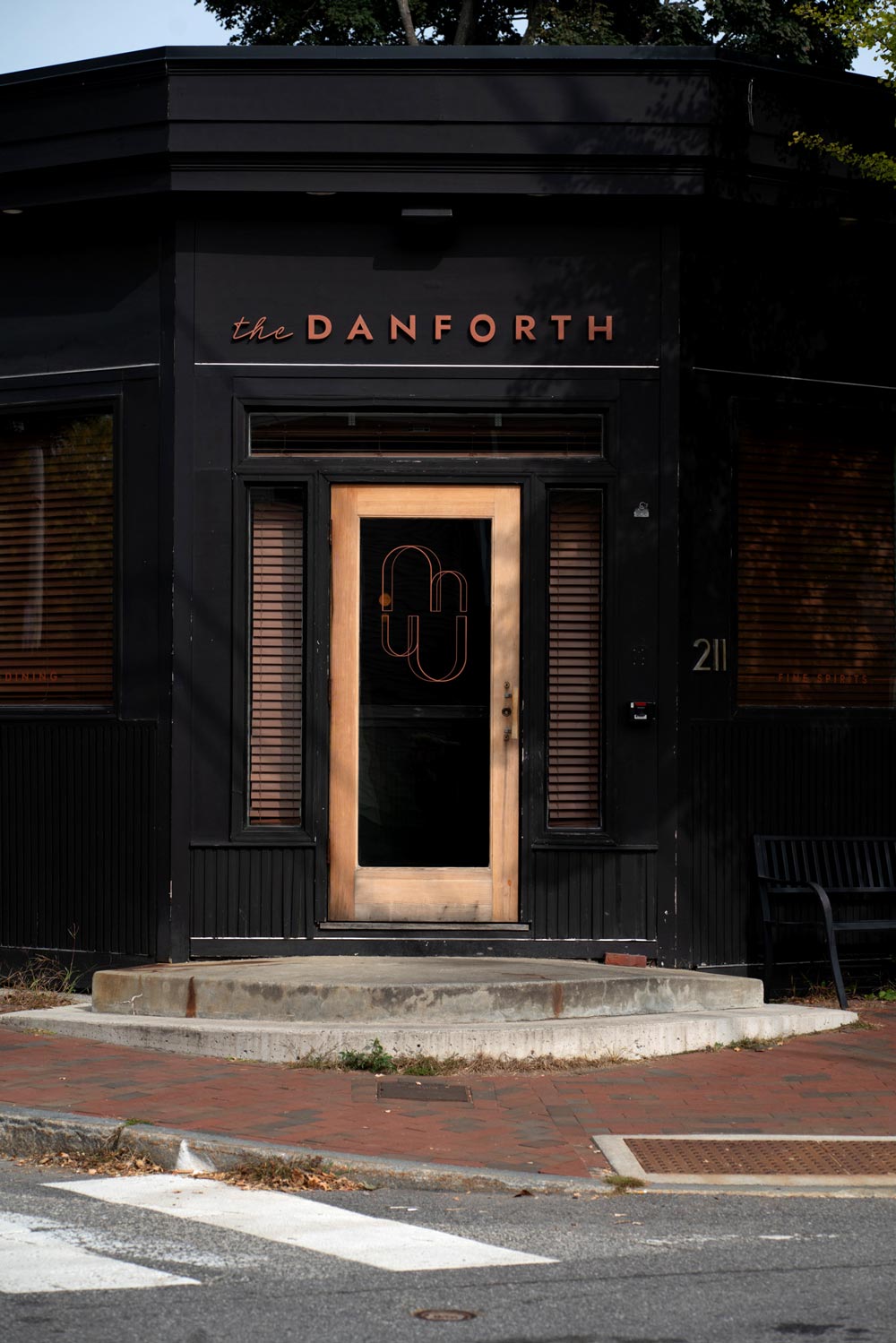
At the heart of this project is the community and its neighborhood. Sited on a residential street corner away from the central retail and hospitality district of Portland, the restaurant primarily serves the local Portland community and provides a mix of spaces for them. The front bar room is kept casual – no reservations allowed – with a long bar to maximize seating. Booths are situated in a manner that they face and engage with the bar area and the entry. The lounge beyond is reservation based, and is suited for more intimate dinners, while an area just up the stairs near the kitchen known as the ‘party pod’ hosts large family and friend gatherings. When seated there it almost feels like a private dining room. These spaces, along with the patio, help provide all scales of engagement with its community and patrons.
