Designlines Sunnyside Townhouse’s bathroom featured in Designlines’ ‘Bold Tile’ tile article!
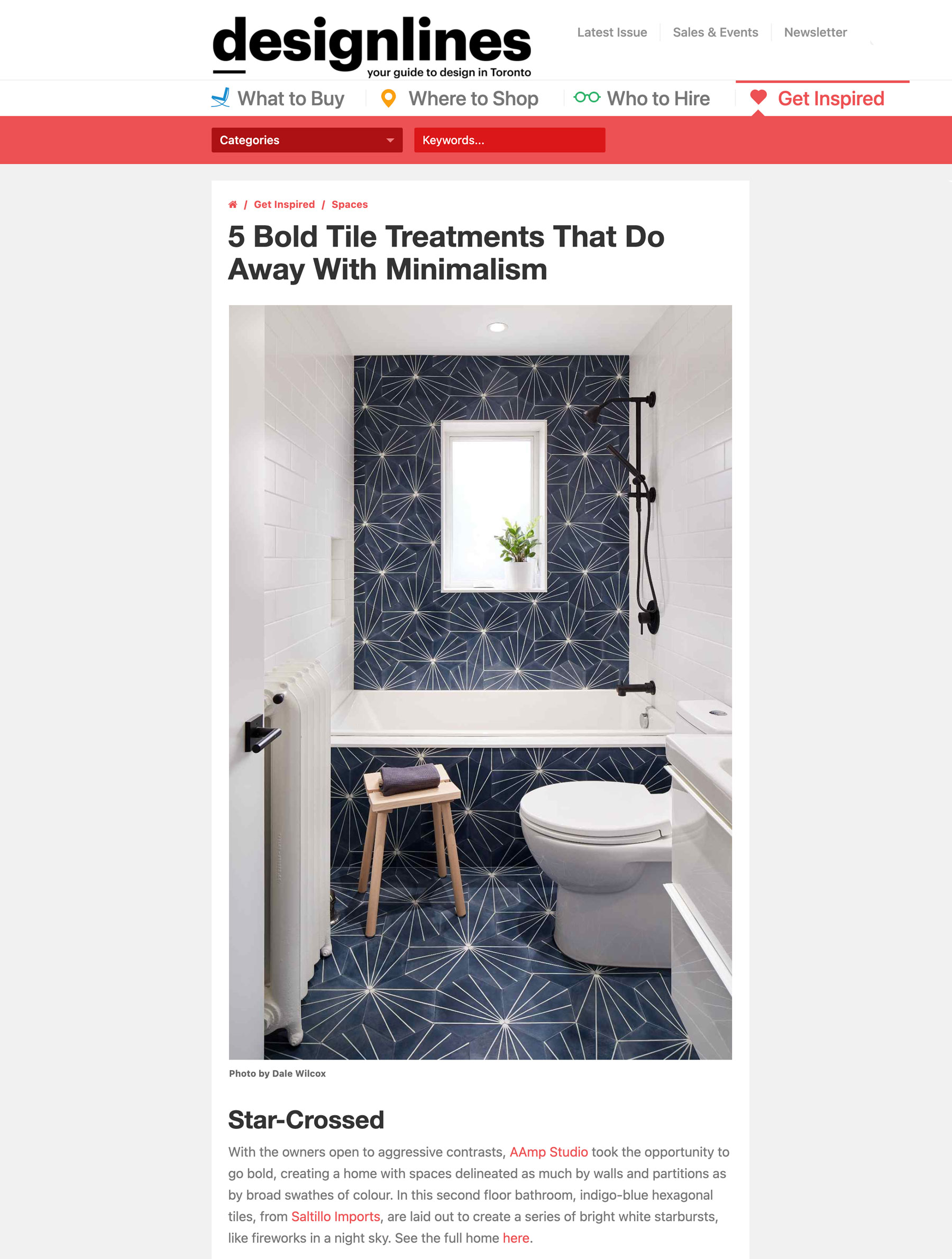
Fun to see the kid’s bathroom at our Sunnyside Townhouse project featured in Designlines’ article on bold tile treatments!
—
5 Bold Tile Treatments That Do Away With Minimalism
Sometimes, you just want your space to be a bit extra
By Designlines
We’re as big a fan of clean, contemporary spaces as anyone. A minimalist approach can make a room look and feel bigger and brighter, and in Toronto’s long, narrow lots, what’s needed more than that? Plus, all those white walls and blonde hardwood create some cozy mid-century vibes. Sometimes, though, there’s room enough for a few defiant, saturated splashes of pattern and colour, and surroundings that feel less Scandinavian than Mediterranean, with less white oak than vivid stone tile. Below, we’ve collected some of our favourites bold designs, available at a Toronto tile store near you, from projects we’ve featured – and naturally, greatly admired – in the past.
The Best Medicine
Given that medical professionals often spend long hours working in sterile spaces, perhaps it’s only natural that they seek the opposite in their home. That is, at least, the case here. Although rather than leave work totally behind, the pair living here had artist Cindy Blaževic transfer colourful photographs of medications onto white tile. See the home here.
Faux Naturel
A tight budget shouldn’t be a reno-killer. Wanting to affect a feeling of organic wellness and luxury, but wanting to skip the accompanying price tag, Reflect Architecture clad the back wall of this clinic lobby with large format printed porcelain tiles, from Ciot, instead of expensive rose quartz. The look is bang-on, and with porcelain being far lighter than quartz, the inset doors work perfectly. See the space here.
Colour Coordinated
What was once a sombre Edwardian received a bright, vivid update courtesy of architect Heather Asquith and interior designer Julie Reinhart. Given the mission to make a playful, bright, family-friendly home, the abundant use of colourful tiles was inevitable. In the kitchen, a bright red subway tile backsplash creates a warm visual focal point, while the kitchen island provides a gentle tonal contrast to the azure-hued millwork. See the home here.
Star-Crossed
With the owners open to aggressive contrasts, AAmp Studio took the opportunity to go bold, creating a home with spaces delineated as much by walls and partitions as by broad swathes of colour. In this second floor bathroom, indigo-blue hexagonal tiles, from Saltillo Imports, are laid out to create a series of bright white starbursts, like fireworks in a night sky. See the full home here.
Pixel Perfect
While approaching this Edwardian reno with a sense of preservation, Architect Vanessa Fong still found room to punctuate it with the occasional colourful flourish. Downstairs, old baseboards, original narrow-plank hardwood flooring and mahogany panelling retains the home’s century-old character, but the kids’ bathroom, clad in a rainbow of mosaic tile, from Olympia Tile, feels far more youthful. See the home here.


