A Day-To-Night Portland Restaurant for All Seasons
Designed by Aamp Studio and hospitality group Gin & Luck, The Danforth offers a dining experience for every type of patron
As told to Hadley Gibson
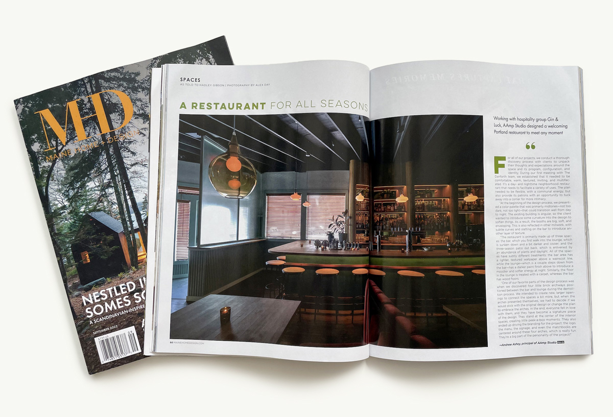
“For all of our projects, we conduct a thorough discovery process with clients to unpack their thoughts and expectations around the space and its program, configuration, and identity. During our first meeting with The Danforth team, we established that it needed to be comfortable, warm, textured, inviting, and multifaceted. It’s a day- and nighttime neighborhood restaurant that needs to facilitate a variety of uses. The plan needed to be flexible, with a communal energy, but also provide its patrons with an opportunity to tuck away into a corner for more intimacy.
“At the beginning of the design process, we presented a color palette that was primarily midtones—not too dark, not too light—that could transition well from day to night. The existing building is angular, so the client wanted to introduce some curvature into the design to soften things. As a result, the booths are big, soft, and enveloping. This is also reflected in other millwork, with subtle curves and slatting on the bar to introduce another layer of texture.
“The restaurant is primarily made up of three spaces: the bar, which you first walk into; the lounge, which is sunken down and a bit darker and cozier; and the three-season patio out back, which is enlivened by an abundance of plants and daylight. All of the spaces have subtly different treatments: the bar area has a lighter, textured wallpaper above a wainscot line, while the lounge—which is a couple steps down from the bar—has a darker paint finish above to introduce a moodier and softer energy at night. Similarly, the floor in the lounge is treated with a carpet, whereas the bar has wood floors.
“One of our favorite parts of the design process was when we discovered four little brick archways positioned between the bar and lounge during the demolition process. We intended to create new, larger openings to connect the spaces a bit more, but when the arches presented themselves, we had to decide if we would stick with the original design or change the plan to embrace the arches. In the end, everyone fell in love with them, and they have become a signature piece of the design. They stand at the center of the interior spaces, creating little peek-a-boo moments. They also ended up driving the branding for the project: the logo, the menu, the signage, and even the matchbooks are centered around these four arches, which is really fun. They’re a big part of the personality of the project!”


