AIGA Graphic Space! Compartes Melrose featured on AIGA’s Eye on Design
We’re somewhat late to the punch here, but a great and thoughtful write-up by Bryn Smith over at AIGA! An excellent observation on graphic identity in space.
—
The Magical, Hidden World of L.A.’s Compartés Chocolate
By Bryn Smith
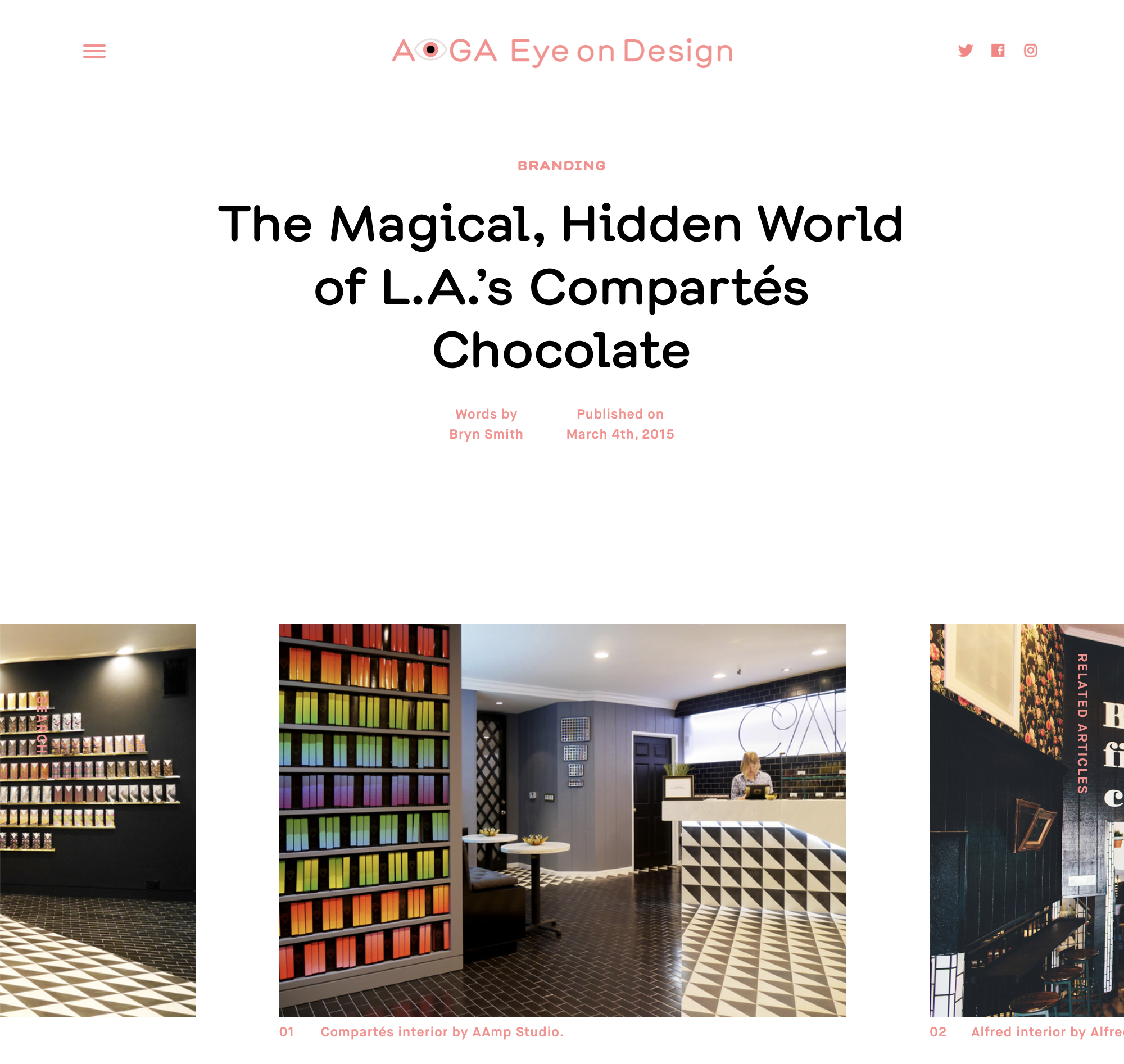
Beverly Hills is picturesque California: stately palms, manicured lawns, and row upon row of upscale boutiques. After a long day of sight-seeing, a friend suggested a stop at Alfred Coffee & Kitchen, an espresso outpost near the western end of Melrose Place. Inside, a vague set of instructions “But first, coffee” led us down a narrow staircase and into a cozy, caffeinated hideaway. What caught my eye was not the espresso bar, but another room at the back of the subterranean space, paved in black tile with a sign above the door that read: Compartés.
Coffee in hand, I wandered inside feeling a bit like Alice down the rabbit hole. The dark flooring gave way to a pattern of black and white triangles, with an angular marble counter at one end and a wall of brilliantly packaged chocolate bars at the other. A built-in bookcase held hundreds of rainbow-colored boxes, and a neon sign on the back wall proclaimed “Chocolate Is Art!” The girl behind the counter seemed accustomed to disoriented visitors, and welcomed us with a few samples—thankfully none of them read “eat me.”
Compartés is the creation of Los Angeles-based chocolatier Jonathan Grahm, and the Melrose location is the company’s first concept store (a factory and retail outlet in Brentwood came first). Designed by AAmp Studio, the challenge for architects Andrew Ashey and Anne-Marie Armstrong was how to take a partially submerged retail space, tucked behind a coffee shop, and make it desirable. “Fortunately, there are two entries,” Ashey notes. In addition to the french doors separating Alfred from Compartés, there’s also a rear entrance that opens into an alley behind the shop. Inspired by the unusual layout and the triangular geometry of the brand—Grahm’s chocolate bars break into triangles, not squares—the space lent itself to a uniquely graphic solution.
“We’re architects primarily, but we’re very invested in this crossover between new media and architecture,” Ashey explains. “Not only internet and video, but how graphics, patterns, and the two-dimensional stuff you might find in print can inform the way you experience a space.” The result is both playful and immersive, drawing visitors around the small store (usually in search of the perfect Instagram shot) and into the colorful world of Jonathan Grahm.
A labor of love since he took over the family business at 25, Grahm has always thrown himself wholeheartedly into every task—from recipes to design. Working with a very small team—there are only 12 employees including retail and factory workers—his focus is primarily on doing things differently. “Anyone can make or do anything they want to, if they just do a little bit of homework,” Grahm says. A self-taught auteur, he’s learned Photoshop, Illustrator, and how to perfect English toffee, largely through online research. This philosophy extends to the company’s packaging and logo, which has grown up and evolved over the years along with Grahm’s vision and skill set. The design team, composed of Grahm acting as creative director, plus designers Kyle Poff, Jan Milligan, and Thomas Jackson, handles everything from the custom typeface for the Compartés logo to the bold, sometimes zany graphics.
The chocolate bars feature prominently in the Melrose space, their radial arrangement on thin gold shelves inspired by the art deco architecture found around Los Angeles. To examine them closely is to tumble again into an almost magical worldview. There’s “California Love,” a dark chocolate and pretzel concoction whose box is Grahm’s riff on the iconic wallpaper at the Beverly Hills Hotel, with banana leaves swapped for palm trees on a pink-to-orange gradient backdrop; packaging for “The Campfire Bar,” with dark chocolate and s’mores, is composed of over 40 photos taken by Jonathan and his friends, collaged together into a surreal scene featuring mountains, white-water rafting, and a very tiny image of Grahm swimming on a recent trip to Puerto Rico; for “The American Dream,” vintage red, white, and blue fabric found at a local flea market was scanned in and manipulated; “Cereal Bowl” features photos of Lucky Charms and cornflakes shot by Grahm on his iPhone.
“Sometimes they take forever, and sometimes they take 15 minutes,” Grahm says. Each box is numbered, like a work of art, with added detailing like a poem about the recipe on the back, and a knocked-out, inverted triangle in front containing the Compartés logo, the bar’s name (usually in a unique typeface), and a miniature sans-serif “LA”—floating just above the vertex.
In someone else’s hands, all these contrasting details might be too much, but Grahm, by making Compartés an extension of himself, lends an authenticity to the brand that allows for wild experimentation. In comparison, Mast Brothers chocolate, a now iconic Brooklyn brand, and perhaps the closest thing to an east coast counterpart, feels appropriately reserved—with staid patterns of stripes and anchors. Compartés, at least to this visitor, might sum up L.A. itself—gaudy, elegant, gritty, stylish, fluorescent, and unbound by convention. Which is how a box of “California Love” ended up on my own bookshelf long after my trip to L.A. ended—a reminder of sunsets and piers to get me through another New York winter, and a little piece of California to bring back home.